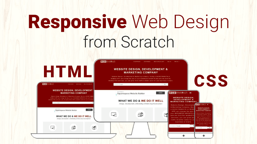
How to Build a Responsive Website from Scratch 2024
Last updated on December 20, 2024 by App Jeevan
"The future belongs to those who embrace recent tech trends today."
You can create custom responsive designs using just HTML and CSS only. Some of the great responsive email templates are designed in using just HTML and CSS because most of the email clients do not support Media Queries.
But you can’t make a complex custom responsive design by using HTML and CSS, for that purpose you need to use Media Queries and sometimes, even javascript
Today, a website must not look good only on a desktop screen, but also on tablets and smart phones.
A website is responsive if it can adapt to the screen of the client.
Responsive web design is extremely important nowadays and is one technique you need to master as a web designer.
In this article, I’ll show you how to easily build a custom responsive website and how to apply custom responsive design techniques on existing web pages in three easy steps.
Before you start a responsive design from scratch you need to keep some points in your mind as below:
1. Use meta tag in your website top of the header:
Viewpoint Meta Tag: Put viewport meta tag inside your page head area. This viewport tag will prevent the browser from zooming out the page. Thus it will remain the same width of the screen size.
Example:
2. Every code should be in % (percentage) instead of px (pixels).
Example:
3. Try to use flexbox layout as much as possible.
The Flexible Box Layout Module makes it easier to design a flexible responsive layout structure without using float or positioning.
Before the flexbox layout module, there were four layout modes:
- Block, for sections in a webpage.
- Inline, for text.
- Table, for two-dimensional table data.
- Positioned, for the explicit position of an element.
Example:
4. Beautify your design for tablets and smart phones screen by using media queries.
Now apply media queries in our CSS file, this is done with the help of condition statements. In the condition provide the min-width and max-width to target screen size.
Conclusion:
Hope you like this Responsive Website from scratch (HTML & CSS). I would also like to tell you that designing a responsive website from scratch can be a time-consuming job. There is also an easy alternative for responsive web design.
Alternatives of Responsive Web Design:
If you want to explore more responsive Front-end Frameworks for your upcoming projects than you can Visit Here.
"Innovation thrives when we keep up with recent tech trends."
If you would like more information about the How to Build a Responsive Website from Scratch 2024, please send us an email.

Written by App Jeevan
Recent Tech Trends
Stay updated with recent tech trends revolutionizing the world! Explore AI breakthroughs, blockchain innovations, and IoT connectivity. Discover how 5G, cloud computing, and AR/VR are reshaping industries and everyday life. Embrace the latest advancements in green tech, cybersecurity, and smart devices to stay ahead in the fast-evolving tech landscape.